



















OG Template Sizes and Starting Points
You drop a link in Slack and the preview slices the headline in half. Or LinkedIn shows a square crop of a wide banner, and the only words left are the logo. The design was fine. The frame was the wrong shape for a link card.
The size that survives those crops is 1200×630, about 1.91:1. Design that one frame in Canva, keep the title in the center, and reuse it as the Open Graph image. When every page has a different title, generate a copy from that same file with Layerre instead of exporting a new PNG each time. A downloaded pack of generic cards will not match the site. The starting point is a blank frame at the right size.
Which size should the template be?
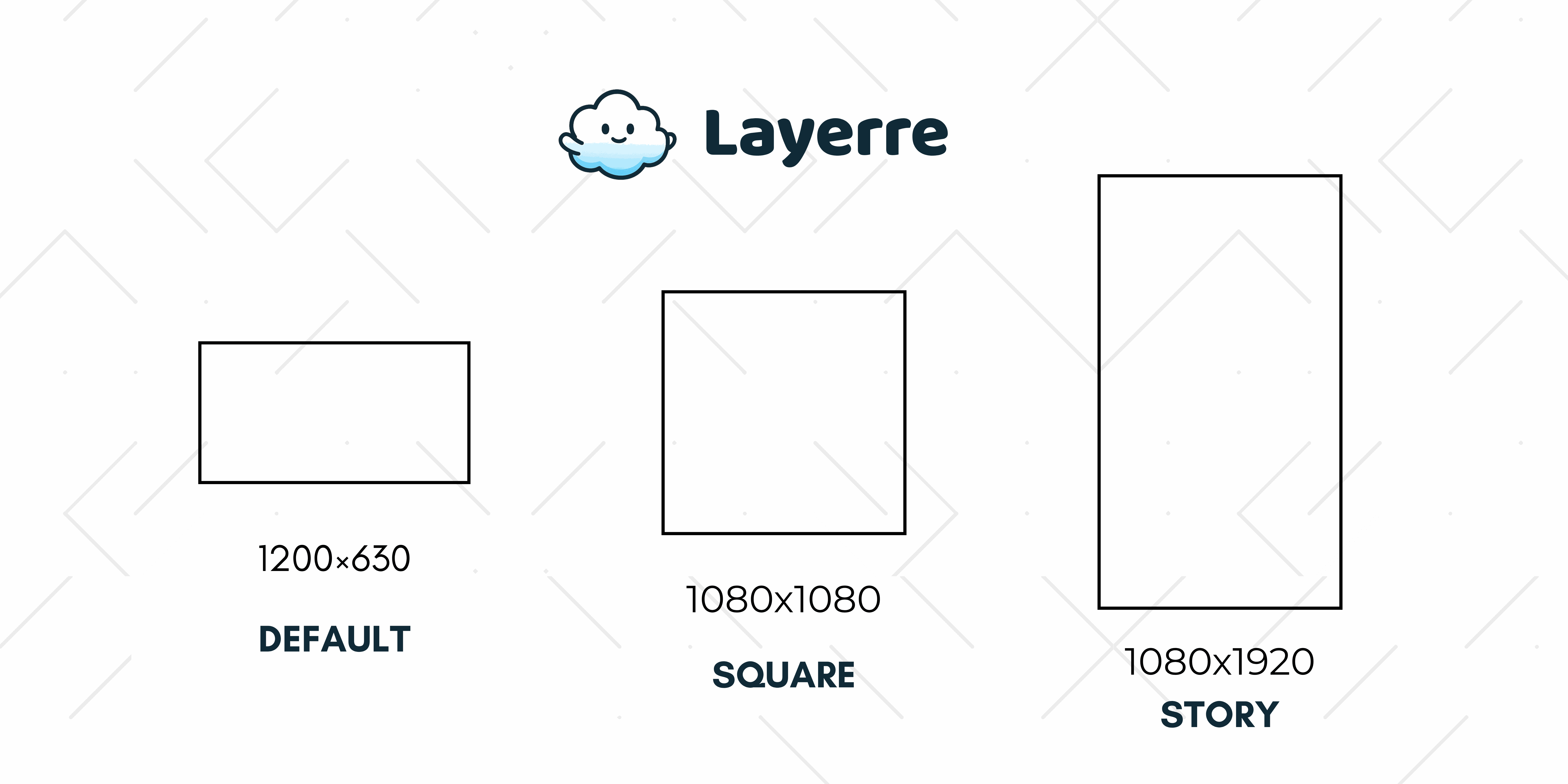
| Use | Size | Ratio | Where it shows |
|---|---|---|---|
| Open Graph default | 1200 × 630 | 1.91:1 | Facebook, LinkedIn, Slack, iMessage |
| X summary large image | 1200 × 630 | ~1.91:1 | Same file as og:image in most cases |
| Square share | 1080 × 1080 | 1:1 | Feeds that crop toward a square |
| Story / portrait | 1080 × 1920 | 9:16 | Only if you also design a story size |
Facebook, LinkedIn, Slack, Discord, and iMessage all accept 1200×630. X summary cards with a large image are happiest near 1200×628, which is the same file in practice. Design once at 1200×630 and reuse it as og:image and twitter:image. Platform notes and the meta tags are in the Open Graph image guide.
Where should the title sit so crops do not cut it?
The full frame is 1200×630. Several apps show a tighter crop, and chat apps sometimes trim the sides. Put the title, and any short eyebrow, inside a center area of about 1000×500. Logos can sit nearer the edge if losing them would still leave a readable card.
- Two lines of title is the useful maximum. A third line becomes a caption nobody can read in a feed.
- Keep small print off the card. Author, date, and reading time belong in the page, not in 14px type on the preview.
- High contrast beats a photograph with text on top of a face. If you use a photo, put the title on a solid block.
- Check the crop before you publish. The local mock is the OG and X card preview.
Square (1080×1080) and story (1080×1920) are extra frames, not replacements. Add them when a channel actually asks for that crop. A link preview on the open web is still the wide card.
How do you set the frame in Canva?
- Create a custom size of 1200 by 630 pixels. Do not start from a 1080×1080 Instagram post and hope the share dialog crops it well.
- Add one text box for the title and, if you need it, a smaller box for a category or site name.
- Lock the background, logo, and color bar. Those layers should not be mapped to the spreadsheet.
- Export one sample PNG, drop it in the card preview, and read the title at the size a phone actually shows.
Canva's free plan is enough to design this frame. You are not buying a template pack. You are making one master file your brand already matches.
How heavy should the file be?
Stay under about 5MB, and prefer under 1MB. Crawlers fetch this image on a share, not on a design review. Flat color and type export cleanly as PNG. A full-bleed photo is usually smaller as JPG or WebP.
The URL has to be a public HTTPS link that returns image bytes. A Drive preview page, a login wall, or a file that 404s becomes a blank card. If every page title is different, generate the file instead of uploading a new PNG by hand. That step is how to create a custom OG image template.
When do you generate a copy per page?
A five-page brochure can share one image. A blog, a docs site, or a catalog cannot. Keep this 1200×630 file as the template, map the title, and render when the page is published. Pricing for those renders is on the pricing page: 50 free credits, then $15 a month for 500.